Thursday, December 5, 2019

Georgia O'Keeffe: Favorite Artist

This is Pedernal Society made by Georgia O'Keeffe. It was created in 1941. It is Oil on a 20 x 30 inch canvas. I picked Georgia O'Keeffe because I really enjoy the texture of her landscapes. She really captures these vibrant colors and expresses perfectly how the light hits the textures. Everything looks so perfectly smooth like silk. Georgia O'Keeffe is known in the period of American Modernism. 

Wednesday, December 4, 2019

Jessica Watts


This painting is called Big Glorious Burst by Jessica Watts. Jessica is an Australian painter, who is known for her Wallflower series. She loves to use recycled materials as a base for her paintings, especially old wallpaper. She incorporates the vintage flowers and print into the paintings, and adds lots of texture, using thick oil paint. I really love the bright beautiful colors she uses, and the texture that makes the flowers look so realistic. I also like her message behind using the female naked body, covered by the flowers, that it is the feminine power, not sexual power, and that beauty is what is hidden not revealed.

Teresa Haag

One of my favorite artist's that we looked at this semester was Teresa Haag. All of her work to me felt very personal and made you feel like you were there too. This piece is called No Place Like Home and it reminds me of the feeling when you go home after being at school. Her work also impressed me since it is done on newspaper as well. I love the colors that she use's in all her work and how they feel like a small snapshot in time.

Wayne Thiebaud

Wayne Thiebaud
From all the artists we have studied this semester, Wayne Thiebaud stood out most to me. His style is very whimsical, which makes each painting fun to see and analyze. It also draws you to want to see more of his paintings, which is why I enjoyed him most. This painting is called Ocean City, and it is oil on canvas. I love how he captures the bright colors of urban life and the details in it.

Andy Warhol


Andy Warhol was an American Artist who was leading figure in the visual art movement known as pop art. I like this painting because it is bright. I like the colors he uses. The pink and yellow make the face pop. It brings this painting to life.

Leonid Afremov – Rain’s Rustle

Rain's Rustle by Leonid Afremov is was created by oil on canvas using a palette knife. This painting has a lot of texture as well. this is my favorite painting because even though rain is gloomy Afremow still made the painting happy by using bright colors. I also really like the paint strokes that he used to make this painting 

Tuesday, December 3, 2019

Degas- Dancer in Front of a Window

Edgar Degas was a prolific French painter during the 18 and 1900s. He painted in several different styles, including neoclassicism and impressionism. He also created sculptures. Degas had an apparent obsession with French ballerinas, painting them repeatedly, sometimes even the same scene multiple times. The painting I chose, "Dancer in Front of a Window," is a classic example of his work. The majority of his paintings are flooded with light, both natural and artificial. This painting differs only in that the light almost seems to come from the moon, rather than the sun or candles. It's primarily cool-toned, lending it a melancholy and moody feel. Nonetheless, there is an undeniable sense of peace and grace in the work.

Monday, December 2, 2019

Favorite Artist: Edward Hopper

This is a painting done by Edward Hopper called Rooms by the Sea. It is an oil painting created in 1951. I liked this painting because Hopper included small amount of details of both the ocean and a living room. It is a cozy and almost confusing painting. I think it was confusing and interesting because the door leads out into the sea rather than a window looking out onto the sea. Therefore, it is really a room by the sea. I also liked the colors he used and the precision he has in this painting.

Wednesday, November 27, 2019

Favorite artist: Chuck Close

My favorite artist is Chuck Close. I really do love abstract art. I like that his art is abstract, but also very realistic. This painting is called "self portrait 2015". From afar, this is spot on perfect. It depicts the artist's self portrait exactly. Looking closer, it is filled with mini abstract paintings inside each square. I think that is so interesting. I like that he used different bold colors. For my project doing the grid, I wasn't bold enough to choose bold colors. But seeing the way it came out, it really does work. It doesn't make the painting look odd or childish.

Tuesday, November 26, 2019

Monet - The Garden of Monet at Argenteuil


Monet is one of my favorite artists. I love Impressionism, which is the style he used for most of his works. The use of brushstrokes and color is genius. I chose this painting mainly because of the contrast of the bright, vivid colors in foreground compared to the more subtle colors in the background. The bush in the front is also the main focus, due to the composition in addition to his use of color. The detail adds more to the work and allows the viewer to look at it longer and still notice something new.

Favorite Artist: Vincent Van Gogh

Although we learned about many artists throughout the course of this class, my favorite artist when we started and my favorite artist now is still the same--Vincent Van Gogh. I love the versatility in his paintings. He did not commit himself to one subject matter, but painted landscapes, portraits, still life, etc. I have also loved the way you can visualize each brush stroke in the paintings, but it is not excessive where it takes away from the overall scene. This painting in particular is Starry Night Over the Rhone. In this painting in particular, the water is what makes it so beautiful. It is immensely difficult to paint water, and he manages to do so perfectly without sacrificing his style of painting. Throughout this class, I have grown to appreciate Van Gogh more than I ever have.

Frieda and Diego Rivera by Frieda Kahlo

the above painting is done by the artist Frieda Kahlo, and it depicts herself and her husband about two years after they married. I chose the painting because my friend recommended I do my blog post on Frieda as she is my friends', favorite artist. I chose this work in particular as it seemed a little tamer than the majority of her works. my friend told me that Frieda is her favorite artist because of her bad luck. I think the fact that as a child she had polio and then shortly after she was able to walk again was impaled by a metal rod is wild to me. some of her most famous paintings were painted from a hospital bed. 

Wednesday, November 20, 2019

Chuck Close: Leslie Watercolor, Scott Blake: Manson

This is Leslie made by Chuck Close, It is a watercolor painting. It was made between 1972 and 1973. It is a watercolor on paper mounted on canvas. It is 75.2 x 57 inch. I picked this painting because I really love how the photograph captured her blue eyes. I also picked it because I am very interested on how detailed it looks for a watercolor painting. 
This is Manson by Scott Blake. It is barcode art. It was created on September 20,2003. It is made of 50 by 32 barcodes. I picked Charles Manson because I think the story is really insane and I watched a movie recently called "Once upon a time in Hollywood". This movie made me read up on the story and It is insane how one man can create so many deaths without directly doing them. 


Chuck Close and Scott Blake

This was done by Chuck Close. Her name is Kara Walker. Out of all his art, I chose this one because he did a lot of white people so I liked to see a person of color represented. I think it is different because it is different than all the ones that he has done before, and shows different techniques for not only skin color but also hair textures. I really liked how it was done. 

This one was done by Scott Blake. I chose it for similar reasons that I picked Chuck Close's image. I liked that he did Oprah which represented a different race, and challenged different ways of doing it from other times before. It is very similar to Chuck Close's work but I like that it is rectangles instead of circles like Close's. The only thing that I do not like is that it is black and white. 

Chuck Close and Scott Blake

Chuck Close is a contemporary American artist. He paints massive images, usually portraits of either himself, his family, or acquaintances. His story is one of overcoming difficulties, first his face blindness, and second, the fact that he is a quadriplegic. His paintings are composed using a grid, which he then fills in with miniaturized abstract paintings which ultimately make up the face of whomever he is painting. The painting that I chose is titled "Emma."
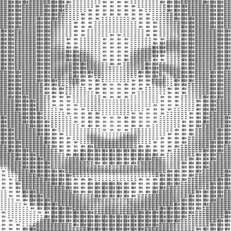
Scott Blake is another contemporary American artist. He often does pop art, but he is most well known for the pieces he creates using only barcodes. This picture of Marilyn Monroe is one of these. His style is very minimalist and clean looking, while simultaneously having a lot of activity upon closer inspection. This artwork is titled "Marilyn Monroe."

Chuck Close and Scott Blake


The first painting is a painting of Oprah Winfrey by Scott Blake. He made this piece in 1999. He actually made it out of barcodes which I find fascinating. Something so plain and usual can make something so beautiful. Plus it is so realistic. The second painting is by Chuck Close. This painting is called Lucas 1. He painted this painting in the late 1960’s/ early 1970’s. I love how realistic this picture it. It’s so colorful but yet so dull. And his eyes are pinpointed at you that makes you want to stare at them. It’s a harsh look, almost intimidating.

Chuck Close and Scott Blake


I like these portraits because of the attention to detail and how realistic these artworks turned out. The artists are able to capture raw emotion in the paintings. By manipulating the way the art is created, the artists provides a different perspective and puts a creative spin on the process. I admire both artists’ work and their effort to make the art their own. 

Chuck Close: Self Portrait ll, 2016 - Scott Blake: Oprah Winfrey

Chuck Close is an American artist. He is most known for his large scale portraits. He contructs his paintings through a grid system. Chuck Close struggled with dyslexia and facial blindness all throughout his life. He also became paralyzed and wheelchair bound later in life. I think it is amazing that he was able to adapt to his new disabilies and still find a way to create such amazing artwork.


Scott Blake is an American artist. He has a similar style of artwork to Chuck Close. He primarlily uses barcodes to create his portraits. His barcode artwork quickly became an internet meme. Blake had an altercation with Close because Close claimed Blake was stealing his artwork. I think it is great that Blake is able to continue to create the artwork he wants in his own unique way. 


Chuck Close and Scott Blake

Big Self Portrait by Chuck Close was done from 1967-1968. It is 107 by 83 inches and is currently in the Walker. He explained that this was done when he was still trying to find himself as an artist, making himself looker tougher than he believes himself to be. He continued to paint self portraits throughout his life that are still on the larger size. 

Ecstasy Self Portrait is a self portrait of Scott Blake that is made out of ecstasy pills. It is composed of over 256 photoshopped ecstasy pills. Scott Blake is known for making art out of other items such as clocks, barcodes and book covers.